Gates N' Fences Redesign
Overview
As a student in the course "HCC 629: Interaction Design", I examined websites with less-than-ideal user experiences and identified ways to improve interactions, enabling users to navigate pages more easily and achieve their goals quickly and efficiently. Gates N Fences is a company that specializes in designing, manufacturing, and installing custom gates, fences, and related products for both residential and commercial properties.
Problem Statement
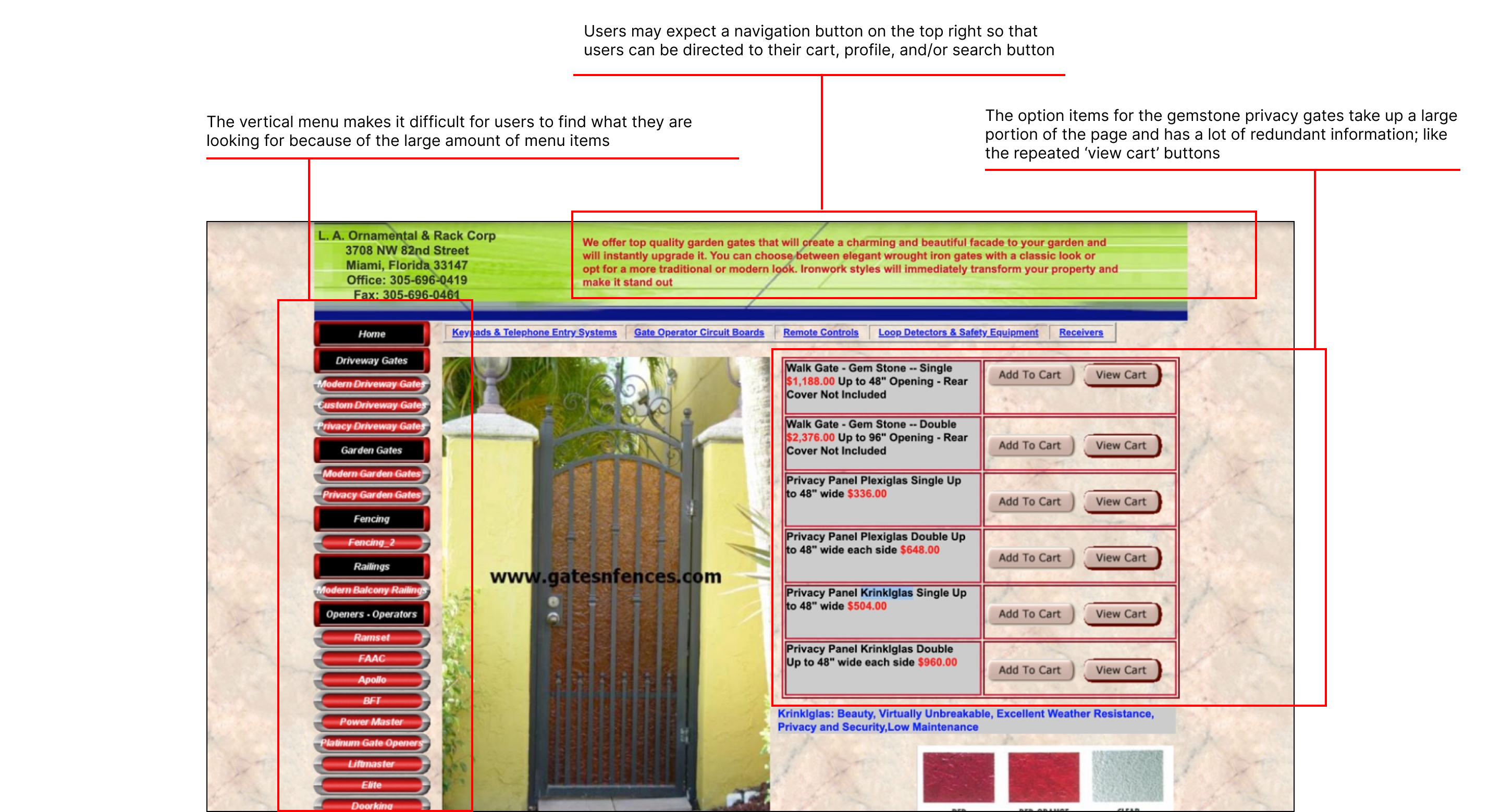
The Gates N Fences website has several navigation challenges. The navigation menu is too long and disorganized, making it hard for users to quickly find what they need. There are also redundant buttons and links that lead to the same pages, cluttering the site and creating confusion. The cart functionality is inconsistent, with no clear cart icon in the header, making it difficult for users to access their cart from other pages. Additionally, the site lacks clear indicators of the user's location within the menu, which can lead to confusion and force users to rely on the back button.
Audience
The Gates N Fences website targets homeowners, commercial property owners, and/or contractors seeking customizable gate and fence solutions for residential or commercial properties.
Role
UX Researcher
UX Designer
Tools Used
Figma
Duration
October 2024
Problem Identification
Navigation within the Current Design
Overwhelming Amount of Text
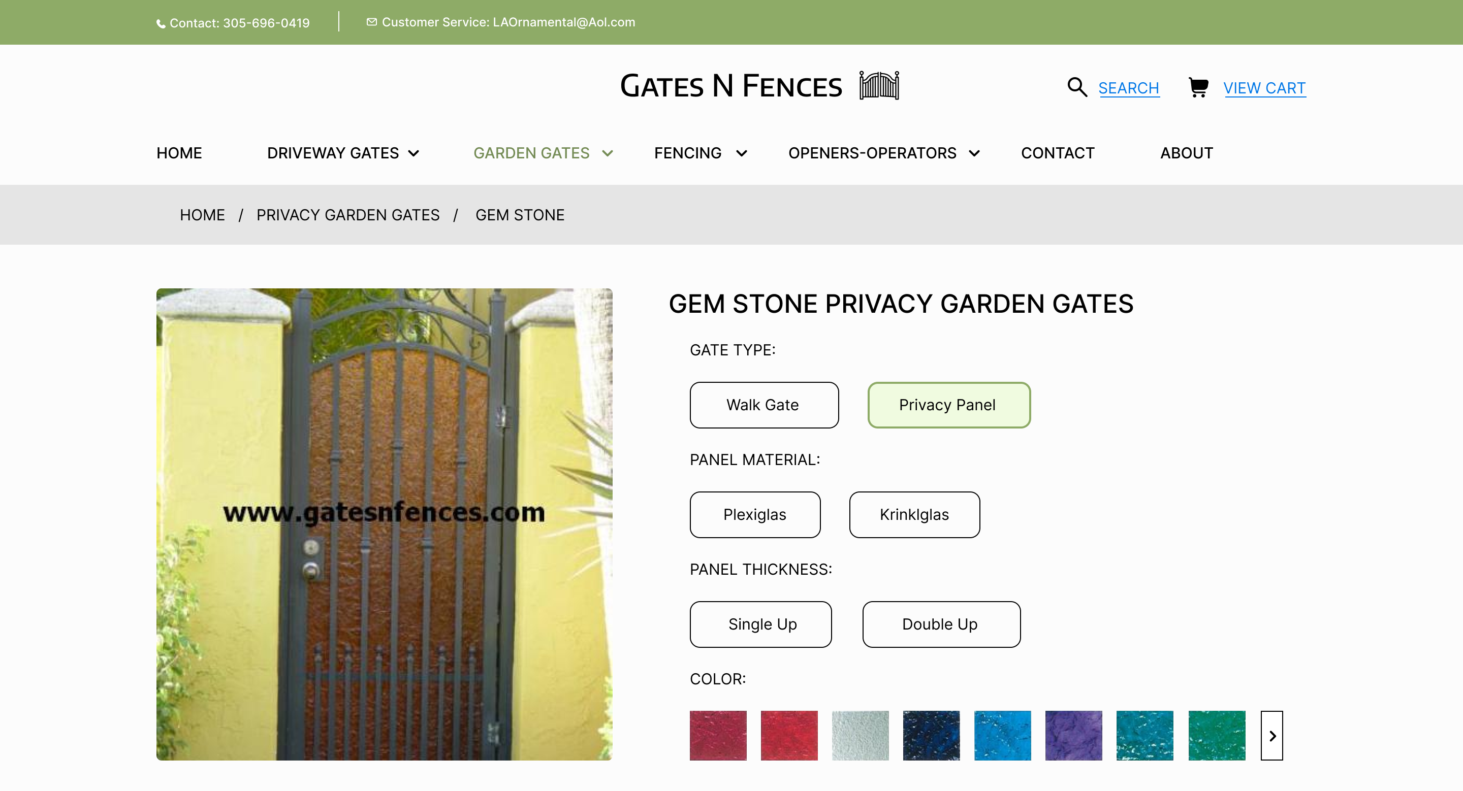
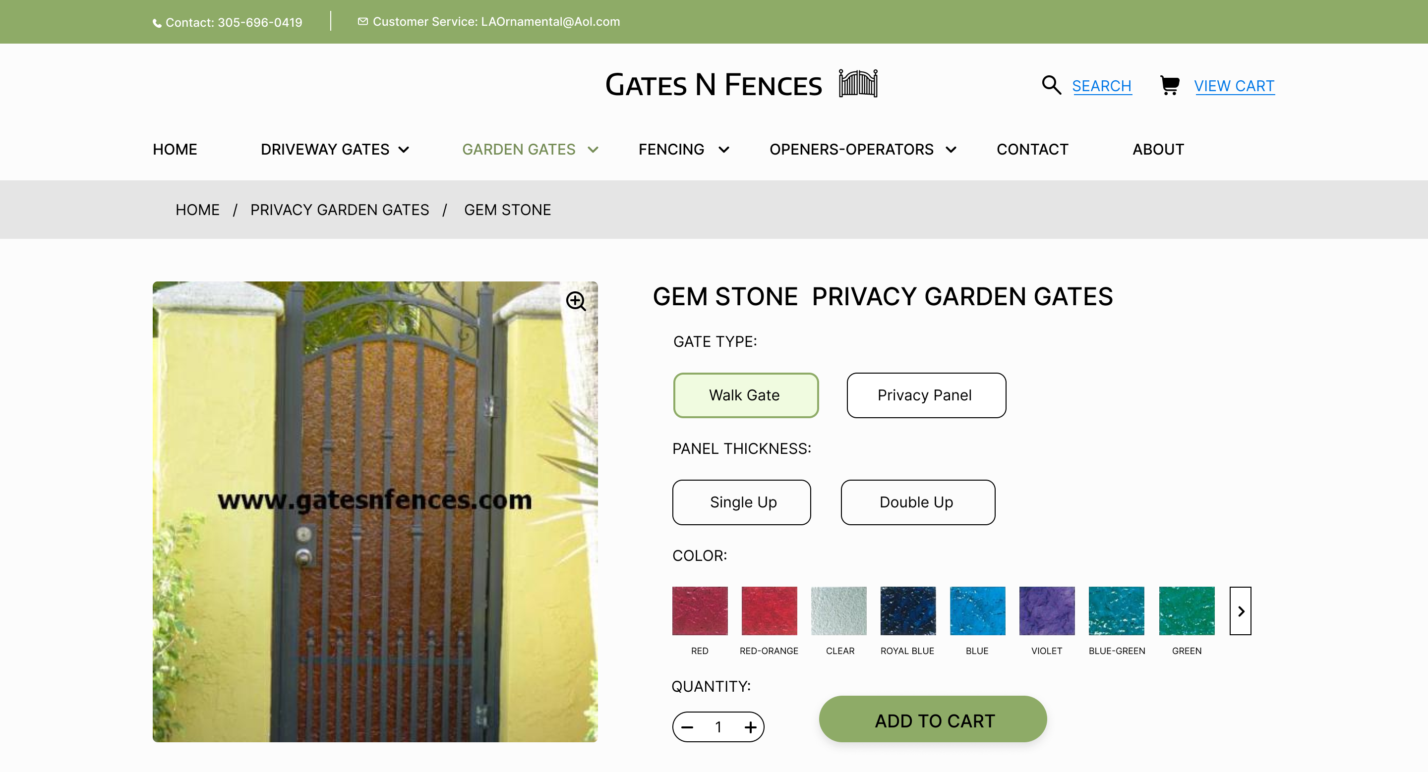
Navigation menu is very long and lacks organization and is not grouped into categories; takes up entire page, may overwhelm users
Redundancy of Buttons and Links
Many buttons and links lead to the same pages, creating clutter; users spend more time sorting through unnecessary options
Cart Functionality
Cart icon only appears on pages where items are being added; no cart indicator in the header; inconsistent with e-commerce standards
Lack of Clear Indicators for User Page Location
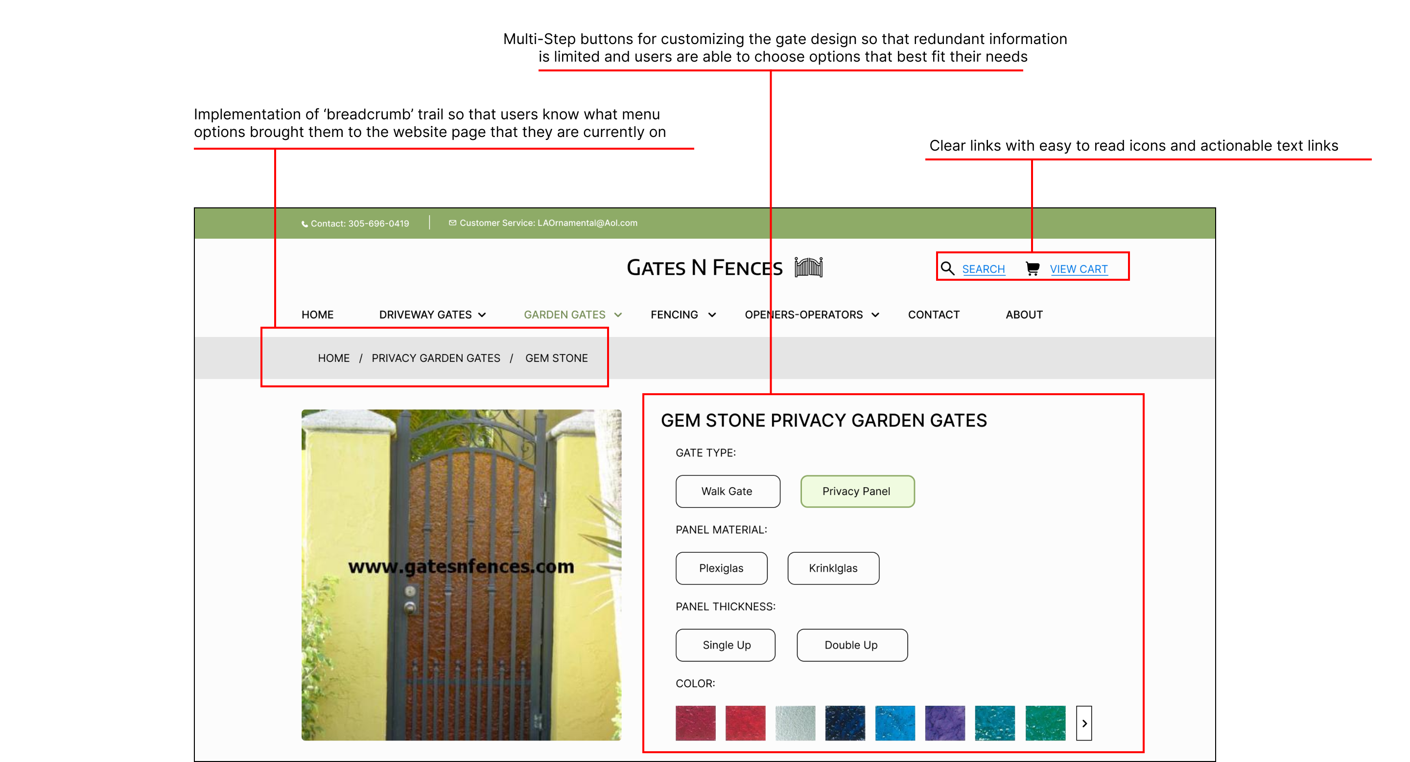
No visible trail or breadcrumbs to show users which page they are on; it is easy to lose track of location after navigating multiple menu levels
Connection to User Experience Concepts
Reference to Lydia Stamato's concept of "Flailing"
• Users don't know where to go once they arrive at a page due to unclear navigation paths
• Lack of a visible trail or breadcrumbs forces reliance on the back button, disrupting browsing
Redesign Goals
Addressing User Journey
- The new navigation of gatesnfences.com is more effective than the previous design
- Users can navigate in an intuitive, step-by-step manner
- Reduces the Gulf of Execution, making it easier for users to understand and achieve their goals
- Adds clarity to navigation, especially for users unfamiliar with gate and fencing terminology
- Provides a trail showing users how they reached the current page
- Particularly useful given the detailed nature of the site's content
- Enhances user confidence in understanding where the icons will lead
- Simplifies access to key actions like viewing the cart or searching for specific items
- Reduces clutter from the previous design by avoiding an overwhelming number of options
- Allows users to scan and select relevant options more efficiently
- Expanding menus make navigation more flexible by showing options in the same window
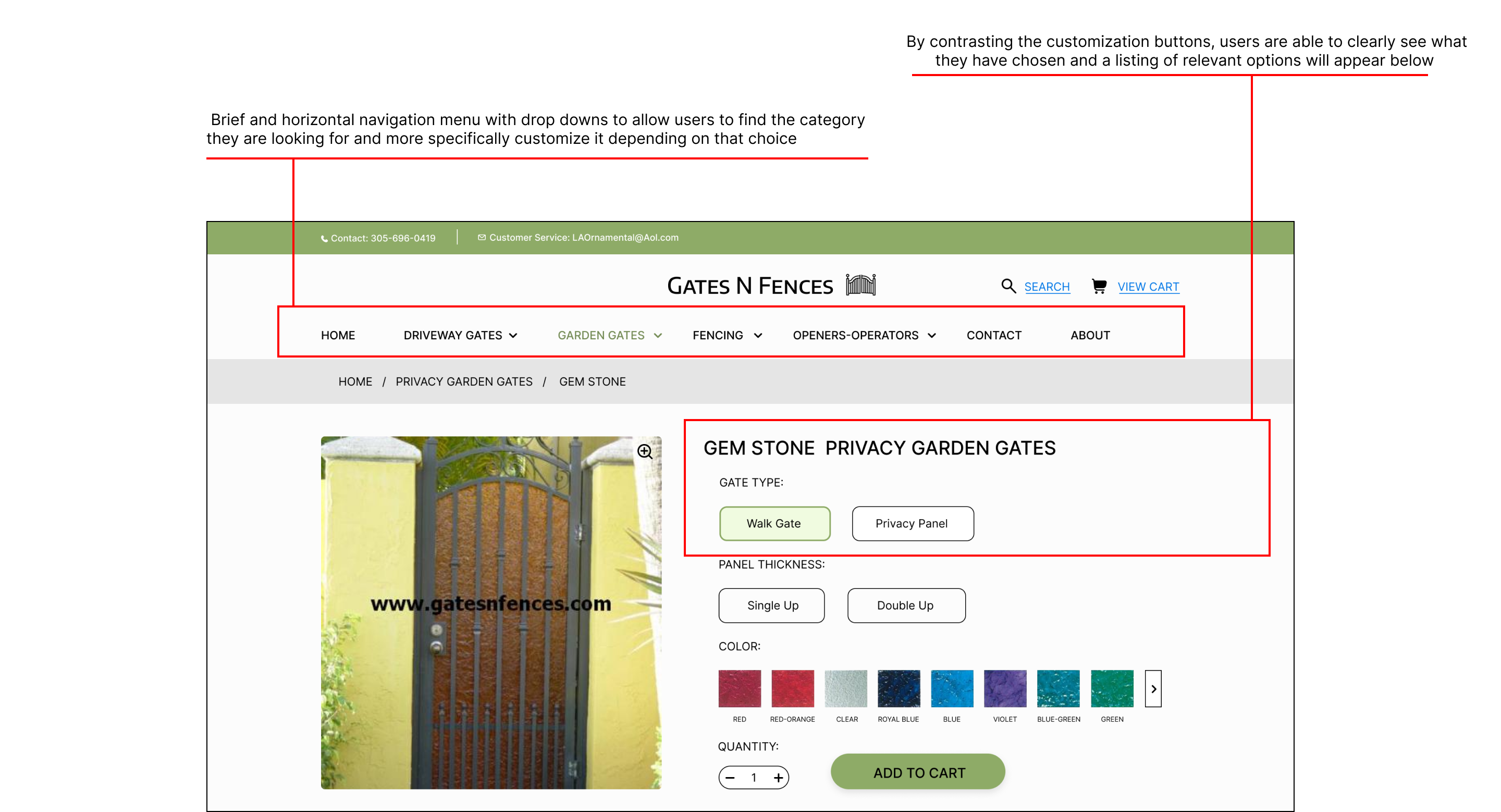
- Avoids user confusion caused by dense text and minor differences in options
- Enables incremental decision-making, making customization more straightforward and accessible
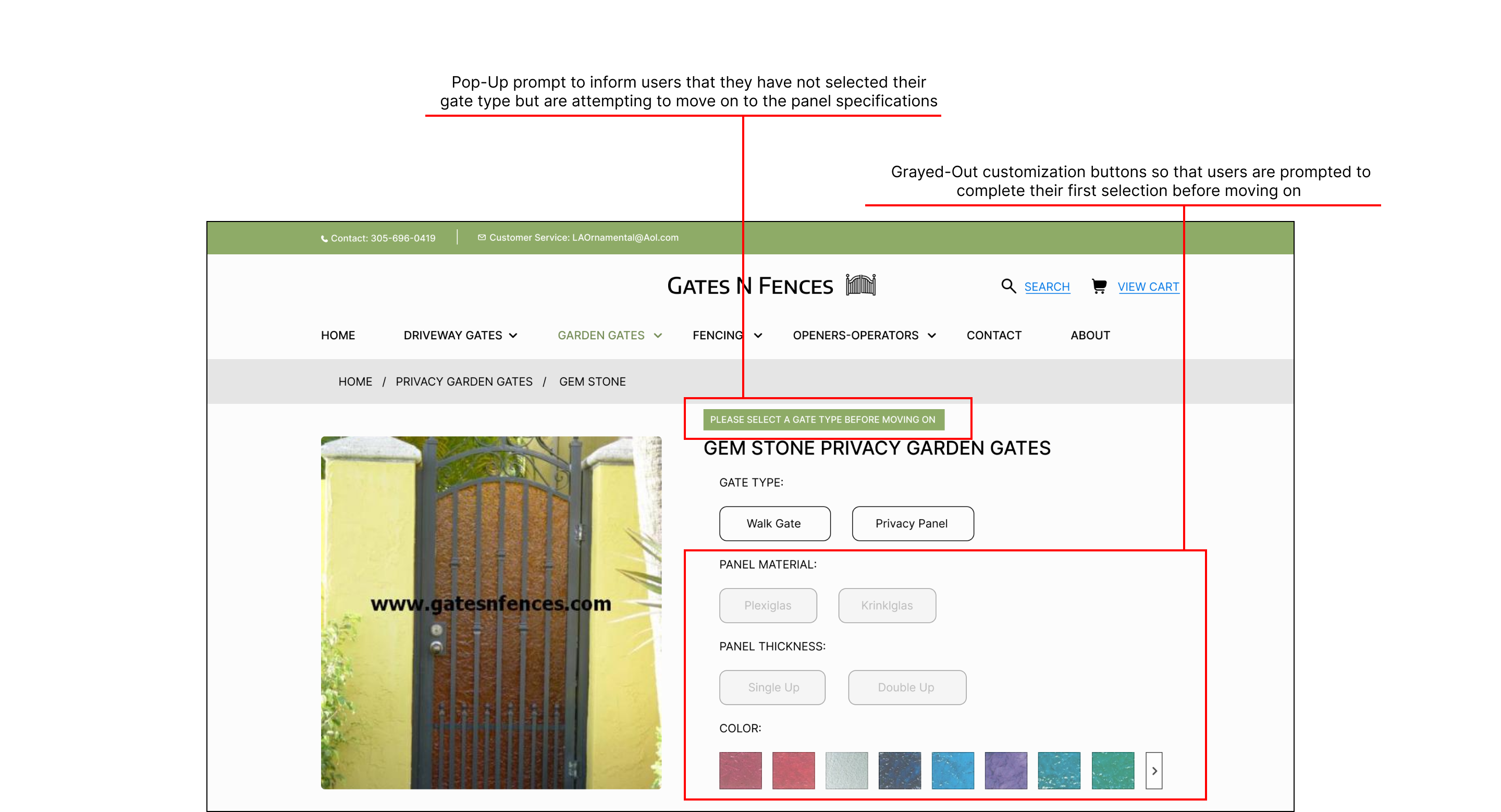
- Prevents errors by guiding users through the process in a logical order
- Ensures users understand why certain options are unavailable, reducing frustration
Conclusion
Overall Benefits of the Redesign
- Provides a seamless navigation experience
- Increases user confidence by making interactions meaningful and predictable
- Allows users to achieve their goals efficiently with minimal confusion or effort
Final Gate N' Fences Design
Detailed Interaction Shown Over 2 Pages
More Projects
Check out my other work